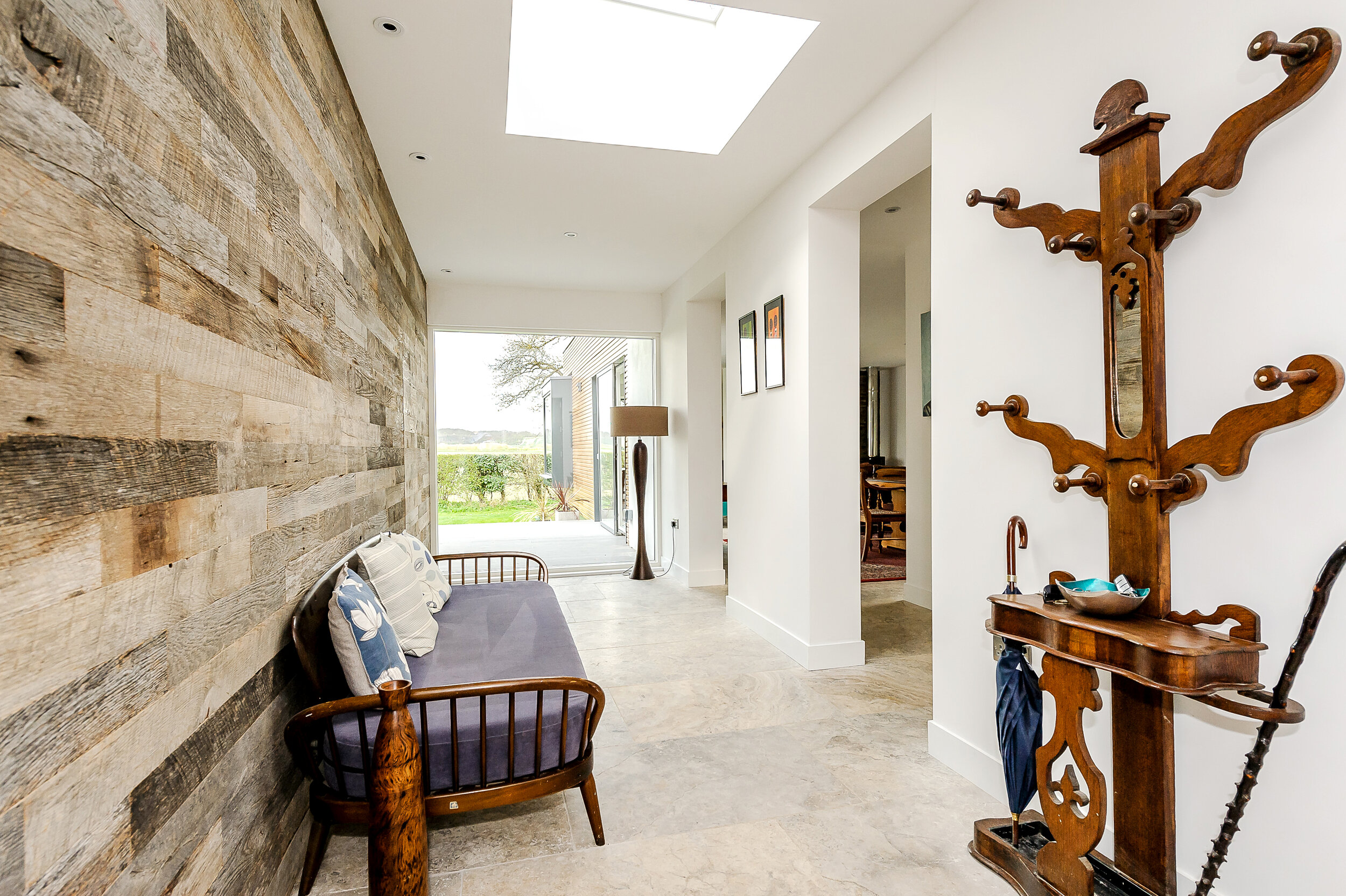
Woodland House.
Location: Cambridge
Built by: Client
Photos: © The Housedesigners (Ltd)
ADOPTING THE PHILOSOPHY OF “TOUCHING THE EARTH LIGHTLY”, IT NESTLES PERFECTLY IN ITS WOODLAND SETTING
The home actually replaces a mobile home, and the effortless design shows how tight sight constraints can be utilised to maximise the site, its surroundings and setting. The house has, at its heart, embraced the Japanese technique of raising the house up off the ground in order to maximise views.

Woodland House was born of a seemingly throw-away comment between the client and the Architect. Woodland House was originally an old, dilapidated mobile home, and the “Wouldn’t it be nice to…” comment grew into a beautifully conceived home. The beauty of the site and setting was obvious, and we decided to use the planning rules of mobile homes as a concept to inform its scale, height and position within the site.
Japanese house were often constructed off the ground originally as a method to keep out moisture and vermin. This grew into a philosophy where this elevated position gave the houses an elevated position over the landscape. This tweaked position within the landscape changed how one viewed the landscape: This grew into a design philosophy which held one’s relationship to landscape at its core ever since. The house is positioned on the edge of woodland - the North East of the house sits within the woodland, whilst the South West sits in landscaped garden.
The Australian Architect, Glenn Murcutt, coined the phrase “Touching the Earth Lightly” - and by lifting the house up on stilts and screw-piles, not only was the ground left mostly untouched, the need for traditional concrete foundations and base walls were completely negated. This meant the home’s carbon foortprint was kept to an absolute minimum.
This worked beautifully in terms of position, but given that the house was to be a single-storey home, the views and relationship to its surrounding was underwhelming. During the design process, we constructed a mini-platform (consisting of pallets and a chair) to explore what height the ground floor should be set at and it was this that was the key to unlocking the design. We then looked at these spaces in-between the house and the landscape, and by creating large outside decks or interesting entrances and exits form the house, this “space in-between” became as important as the design of the house itself.
The internal spaces are arranged around a central entrance with living spaces on one side and the sleeping areas to the other. A hierarchy is created within in which the more “public” areas (entrance, living room, kitchen) are located towards the centre, and the more private and intimate spaces (main bedroom, snug and utility) are located furthest therefrom. These spaces come together via the external raised deck and, like the main entrance area, hold the house together in terms of the relationships of these spaces to each other. the stunning views are to the North East and each room in the house has a view thereof, including the outside decked area. A corner picture window / window seat to the snug captures this view perfectly and is the most used “room” in the house.


