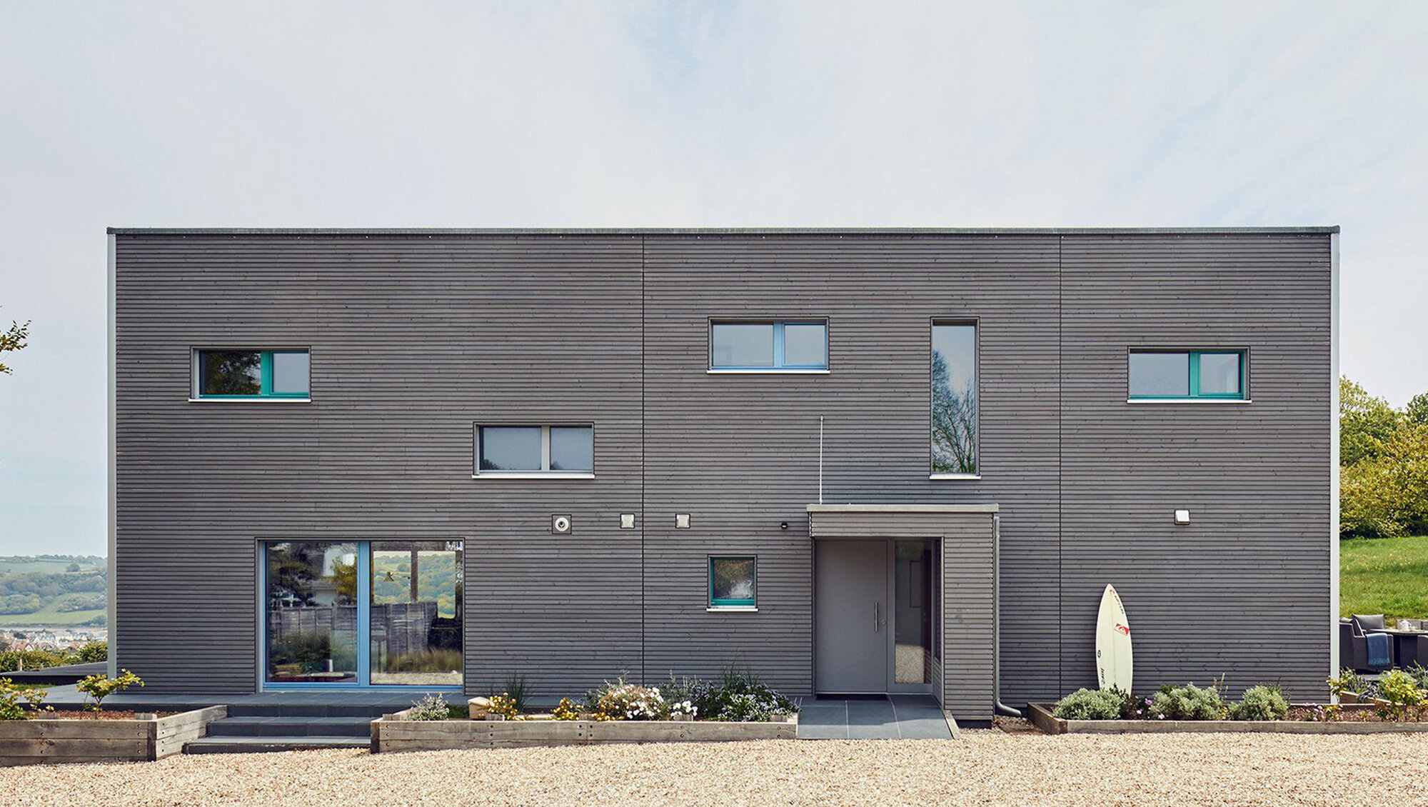
House Rushworth.
Location: Devon
Built by: Baufritz (UK) Ltd
Images: © Baufritz (UK) Ltd
The site is located within an 'Area of Great Landscape Value' making planning very difficult. We could not have a larger footprint nor be taller than the existing house. We created a small compact footprint with a flat roof.

They located a 1930s Bauhaus type house sitting on a secluded site, overlooking the sea, yet still close to all of the amenities of Beer (a pretty coastal village that grew up around a smugglers' cove and caves). Subsequent years had not been kind to the house. Poor quality extensions and updates had ruined the original charm and cheap materials had resulted in an extremely inefficient house with an energy rating of F.
The new-build was positioned in such a way that the north-western corner corresponds to the same corner of the original house. It forms an elongated slender shape positioned along the north-south axis, thereby maximising the views of the cliffs and the sea to the east. Large vertical windows connect the interior with the exterior. Along the eastern façade a free-standing balcony serves as a visual diffusion as well as providing privacy for bedrooms on the first floor. A compact design keeps visual impact to a minimum and increases energy efficiency, as well as reducing construction cost. The new-build was significantly smaller than the existing house which had a width of approximately 8.95m and length of 23.6m. The new-build has a width of 6.95m and a length of only 16.95m while keeping to the same height. The living space for the new-build was exactly the same, with a footprint reduction of thirty percent. Given the fact that the site is situated within a Coastal Preservation Area, the dimensional reduction was sympathetic to this policy as it represented a significant decrease of visual impact.
External cladding in horizontally mounted high-quality timber, treated with a pre-weathering coat allows weathering over time into an attractive silver-grey colour. Doors and windows in grey complement the overall appearance. All sea facing rooms boast expansive glass, allowing seamless access to the terraces and gardens. Views of white cliffs running to the sea enhance the location. Access is via a covered area to the rear of the house. The juxtaposition of the design becomes clear when accessing the interior. Darker colours are superseded by bright light warm finishes. The kitchen and dining areas are located on the ground floor along with a library and studio designed against Walter Gropius's principal that natural light is key to creativity. In a shift from the norm, the living room is found on the first floor where the additional elevation provides uninterrupted views of the beach, bay and white cliffs. Both master bedroom and guest bedroom with corresponding ensuite bathrooms are located here.


